
Quick Guide
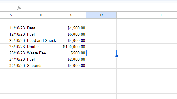
- First, input the series of data you want to visualize in a pie chart.
- Go to “Insert” and click ”Chart”.
- You will have a default chart on your worksheet, and a chart editor shows up on the right.
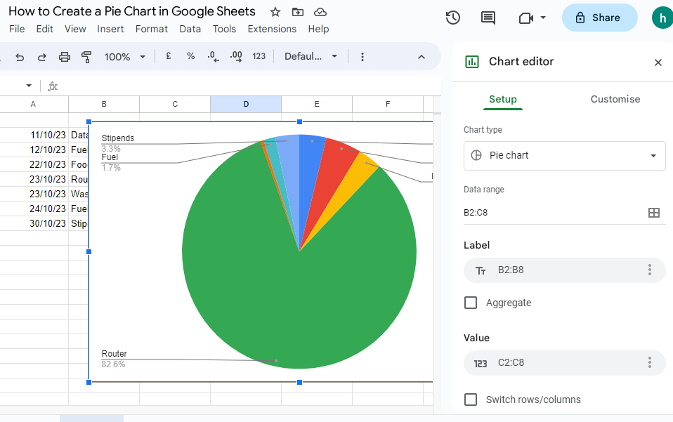
- Navigate to “Setup” on the chart editor.
- Go to ”Chart type” and select “Pie Chart”.
- You also have to select a range of labels (names of each category) for the “Label” section.
- Go to the “Customize” tab in the chart editor and customize your chart if you want.
What is a Pie Chart
A pie chart is a circular form of graph. The slices of pie in the chart shows the estimated size of the data. It is used to put your data in a pictorial form. Pie charts have a way of visualizing your data for easy analysis by whoever you share the data with
How to Create a Pie Chart in Google Sheets
#1. Inserting a Pie Chart
- Input the series of data you want to visualize in a pie chart.
- Go to “Insert” and click ”Chart”. You will have a default chart on your worksheet, and a chart editor shows up on the right.
- Navigate to “Setup” on the chart editor.
- Go to ”Chart type” and select “Pie Chart”.
- You also have to select a range of labels (names of each category) for the “Label” section.
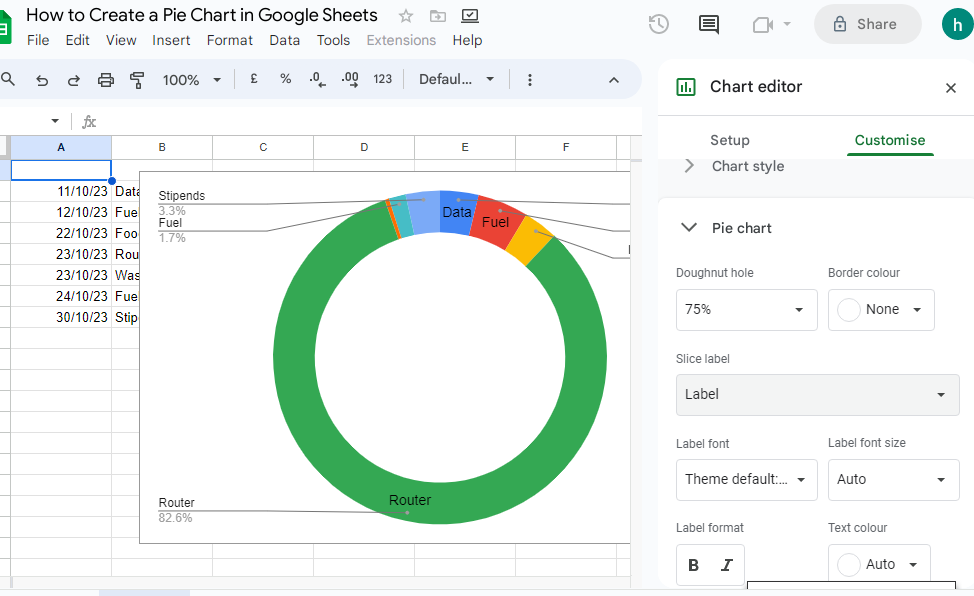
#2. Customizing the Pie Chart
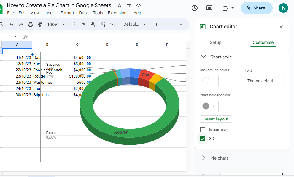
Go to the “Customize” tab in the chart editor and customize your chart if you want.
You can customize and edit a ton of options on your chart. You can change the colors, make the chart look like 3D, add a legend, change around the titles and labels, add a donut hole, change the background color, the border color or set the chart border color to ‘none’.
Interpreting a Pie Chart
Once you have created your Pie chart and customized it to suit your taste, interpret it by looking at the labels and the slices of pie to see the figures they represent.
Sharing and Exporting Your Pie Chart
To share the pie chart, click on the “Share” button. You can add the email addresses you want to share your Sheet with. Or copy the link and send it to whoever you want to share with.
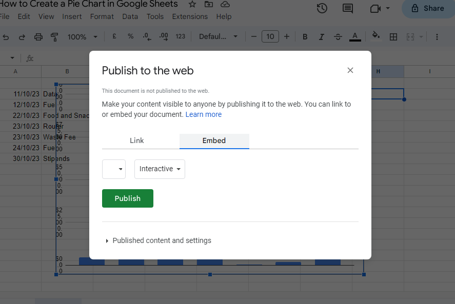
Or click the Chart, and select the three vertical menu. Select “Publish Chart”, and select to Publish the Sheet to the web.
FAQs
Can You Create a Budget Pie Chart in Google Sheets?
A budget pie chart can be used to scrutinize your expenses, rather than just putting the budget numbers on the spreadsheet, thus making it easier to interpret as the pie chart will break down each category of what you are spending, which means you can adjust your spending when necessary. Just input the budget figures into the Google Sheet cells, then create a pie chart to visualize the data.
How Can I Display Values on a Google Sheets Pie Chart?
To display values in Google Sheets, follow these steps:
- Select the Pie Chart in Google Sheets.
- Click on the 3-dot menu on the top right side of the chart, or double-click the chart to go to the “Chart Editor“.
- In the “Customize” tab, select “Data Labels“.
- Select the data label options you want to use from the drop-down menu and click OK.
What Should I do if my Google Sheets Pie Chart is Not Showing All Labels?
All the label in your pie chart are not showing because it is too long to fit in the chart comfortably, or if your sectors are very small. You have to adjust the sectors to accommodate all levels.
Is it Possible to Create a Multi-level Pie Chart in Google Sheets?
A multi-level pie chart which can also be called a sunburst chart or nested pie chart is a set of concentric circles that allow to visualize symmetrical and asymmetrical tree structures in a pie chart. You can create a multi-level pie chart in Google Sheets by stacking separate doughnut charts on top of each other using the customization tool in your Google Sheets.
Here’s how to:
First prepare your Data in Google Sheets. Create the first doughnut chart that will act as the outer layer of the multi level pie chart.
- Highlight the data set, navigate to the Insert tab, and select “Chart.”
- Pie chart will appear with the Chart editor task pane by its side.
- Go to the Setup tab of the Chart editor, and open the “Chart type” drop-down menu.
- Scroll down the drop down menu and under “Pie”, select “Doughnut chart.”
- Increase the size of the donut hole to accommodate the smaller inner layer inside it.
- Then switch to the Chart editor, and select Customize
- Go to the “Pie chart” section
- Set the “Donut hole” value to “75%” to modify the amount of empty space in the middle of our doughnut chart.
- Then remove the background of the chart area to seamlessly stack two doughnut charts on top of each other.
- Then go to the “Chart style” section.
- Under “Background color,” pull up the color palette and choose “None” to remove the background of your chart.
Can I Create Both Pie and Line Charts in Google Sheets?
No, the pie and line chart combo is not available in Google Sheets.