Quick guide
- Open Google Sheets and open the spreadsheet that you want to insert a bar graph or create a new one.
- Input your data into the cells.
- Then highlight the cells containing the data you’d like to visualize in a bar graph.
- On the menu bar click the “Insert” and select “Chart“.
- Google Sheet will suggest a pie chart, so click on the chart type and select bar chart or your preferred chart type in the chart editor. You can also customize your chart.
Bar Graphs turns your spreadsheet into data that is appealing to the eye. In this article are step-by-step instructions on how to create a bar graph in Google Sheets.
How to create a bar graph in Google Sheets
Google Sheet has an inbuilt tool to enable you create a bar graph to represent your data in a spreadsheet.
You can create a bar graph in Google Sheets by following these steps:
- Open Google Sheets
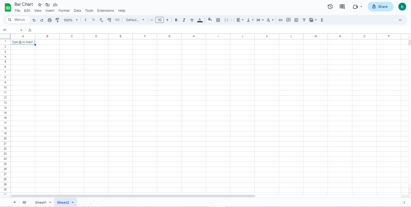
- Go to the spreadsheet you want to add a bar graph or create a new one.
- Input your data into the cells.

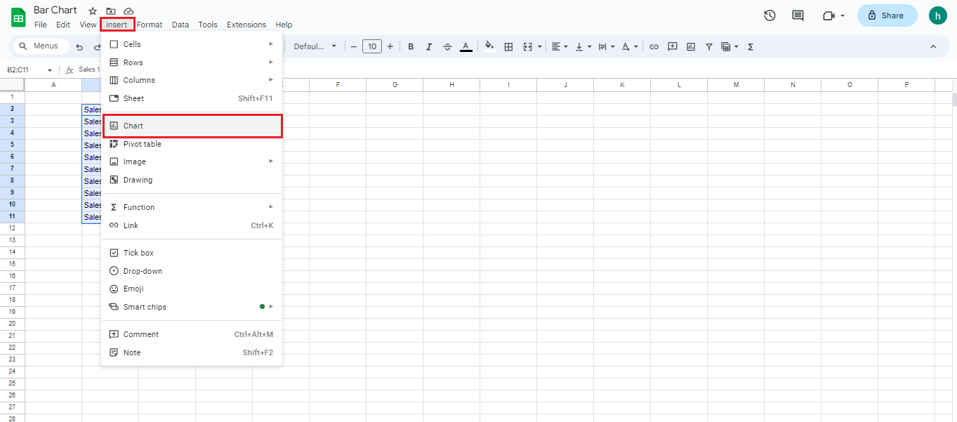
- Then highlight the cells containing the data you’d like to visualize in a bar graph.

- On the menu bar click the “Insert” and select “Chart“.
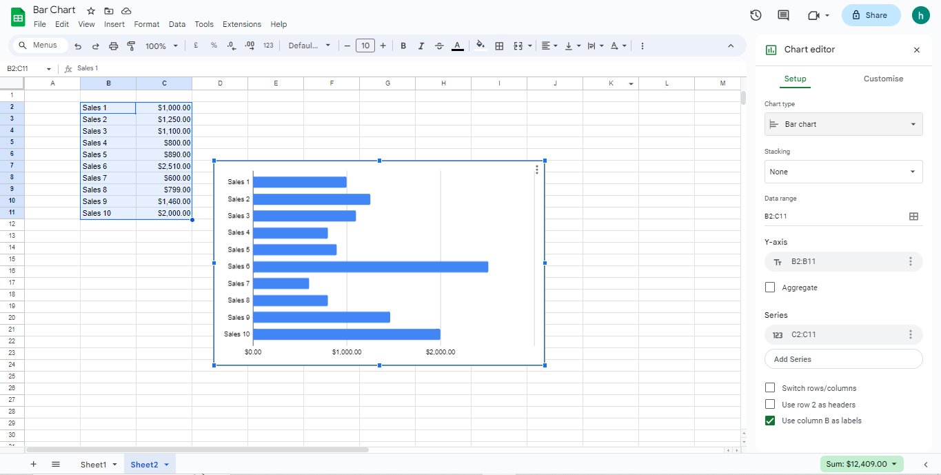
- Google Sheet will suggest a pie chart, so click on the chart type and select bar chart or your preferred chart type in the chart editor. You can also customize your chart.
How to label a bar graph in Google Sheets
Here’s how to label a bar graph in Google Sheets:
- Input your labels on another column, it can be your headings.
- Go to your bar graph and click the 3 dots in the upper right of your bar graph.
- Select “Edit the chart”.
- Under Setup, tick the checkbox “Use Column B as Label” —it can be any column depending on where you typed your labels or headings.
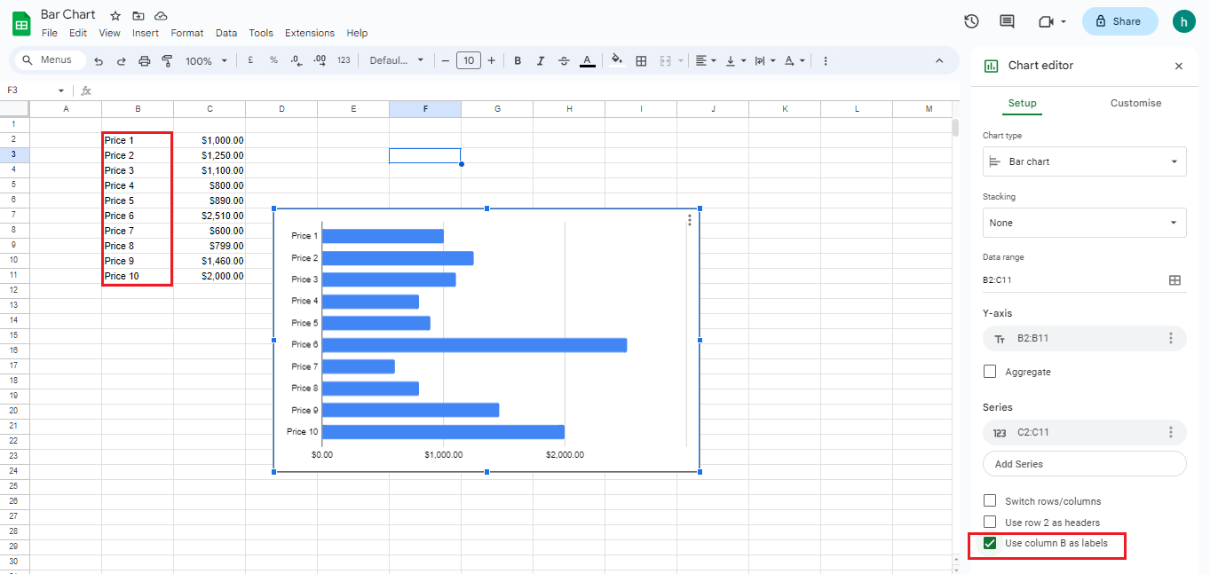
- You can change it by selecting the “Customize” option from the chart editor. Click “Add Labels”, and select the specific range from the spreadsheet that you’d like to display as a label.
- To customize the look of your labels like the type, font, size, color, etc., you will find all of the options to change type, color, font, size, etc.
Different customization option in the chart editor
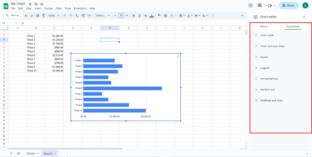
- Chart style: With this option, you can modify the font style, border color, and bar graph background.
- Chart and axis titles: With this option, you get to customize the chart title, change everything regarding the font (type, size, color, etc.), add vertical and horizontal axis titles, add a chart subtitle.
- Series: You can customize the series of you bar graph like the color of the bar. Also, with this option, you can upload error bars and data labels.
- Legend: You can customize the legend settings especially in a multiple series.
- Horizontal axis: This option allows you to customize the font type, size, and format of the horizontal axis label. Also, you can set the maximum and minimum chart values.
- Vertical axis: Just like the Horizontal axis allows you to change the font type, size, and format of the vertical axis label. And also change the placement of the axis and reverse them.
How to make a stacked bar chart in Google Sheets
To make a stacked bar graph in Google Sheets:
- First select a dataset and include the headers.
- Press “Insert” in the toolbar, and select “Chart“.
- Click on “Setup” and change the chart type to “Stacked Bar Chart” in the “Chart Editor” panel.
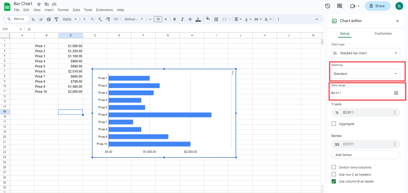
- Double-click on the chart title to modify or edit.
Creating a bar graph in Google Sheets is easy as Google has an inbuilt-tool already. However, you can play around with the customization options to get more familiar with them.
FAQ
Where can I find visualization tools in Google Sheets?
Google sheets has a lot of visualization tools to help your data in visual, easy-to-decipher format.
You can add bar graphs, pie charts, histograms, etc. To start any of these, click the “Insert” option in the Google Sheets tool bar and select “Chart“.
